Journalists who fact check tend to rely on experts.
It makes sense. Journalists possess limited pools of knowledge, and that knowledge is mostly of a general character. Journalists know something about quite a few things rather than having a great deal of knowledge about one specific thing.
Therein lies the dilemma for the fact checking journalist. Which expert is right about the fact they’re checking? Do the experts have their own agendas that might affect the outcome of a fact check?
Salon‘s Glenn Greenwald addressed the issue last December with a column titled “PolitiFact and the scam of neutral expertise.”
Greenwald:
(T)his is a common means of deceit in our political discourse: depicting highly biased, ideologically rigid establishment advocates as some kind of neutral expert-arbiters of fact, even though they’re drenched in all sorts of biases and ideological objectives.
I ran into the issue of the expert agenda while researching the progressive nature of the U.S. federal tax system for my fact check of the Congressional Progressive Caucaus’ claim that across-the-board tax cuts have a regressive tax effect. I found information from well-respected authorities presented through distorted lenses.
Piketty and Saez
Thomas Piketty and Emmanuel Saez are economists interested in the phenomenon of income and wealth inequality. My survey of progressive taxation naturally led me to their paper ““How Progressive Is the U.S. Federal Tax System? A Historical and International Perspective.” The title makes the paper look like a perfect find for my research.
To the contrary, Piketty and Saez focus on progressivity among the highest earners. The paper drops from its consideration the lowest quintile. That segment of the U.S. population has experienced a substantial drop to its effective tax rates over the past 30 years, helping make the U.S. tax system more progressive. It’s not on the radar for Piketty and Saez.
None of this is intended to impugn Piketty and Saez, except as it suggests ideology affects the direction of their research. The economists write for persons familiar with economics, persons who will note the authors’ express focus on subdivisions of the highest quintile and take the information for what it’s worth. Experts, we would hope, will not be misled by distorted charts like this one:
Greenstone and Looney
After encountering the paper from Piketty and Saez (and reading much of it), I encountered an article about progressive taxation from the Brookings Institution. That article was authored by economists Michael Greenstone and Adam Looney and titled “Just How Progressive is the U.S. Tax Code?”
I probably would have taken little interest in the article by Greenstone and Looney except for one of the graphics accompanying it. That graphic contrasted quite a bit with a related graph I worked up based on CBO data for my fact check of the Congressional Progressive Caucus. Here are the charts side by side for comparison:
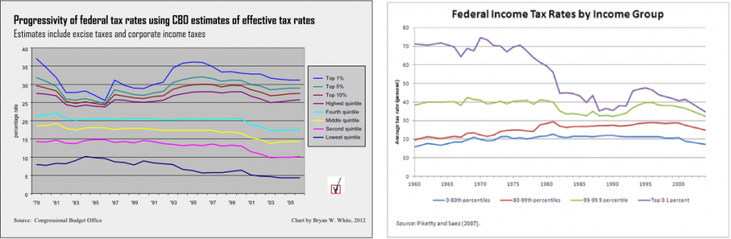
I was struck by the similarity between the light blue line on my chart representing the fourth quintile and the blue line on the Brookings chart representing the first four quintiles. The two lines follow almost identical paths between 1979 and 2004. I wrote one of the authors, Adam Looney, to seek some answers. Looney promptly linked me to the spreadsheet data from Piketty and Saez.
I still couldn’t make sense of the Brookings chart.
I wrote Looney again, pointing out what I took as mistakes on the Brookings chart. Looney again responded promptly. He explained that I erred by trying to create the four-quintile (P0-80) line by averaging the percentages from the separate quintiles.
“You need to take an income-weighted average, you can’t just average the rates across the bottom four groups,” he said.
“(I)f you pay 10 percent and Bill Gates pays 20 percent,” he said, “the average tax paid by the two of you divided by your total income is not 15 percent.”
That explained much about the Brookings chart. But why should we prefer an income-weighted average? If there are twenty guys like me and one like Gates then the average tax rate individuals pay is much closer to 10 percent than to 20 percent. Using the weighted average, Gates will pull the average way up close to 20 percent. And that’s why the P0-80 line on the Brookings chart so closely resembles the fourth quintile line from my chart.
I wrote one last time to Looney. I asked whether combining four quintiles into one line on the graph obscured quite a bit of progressivity in the lower quintiles. I asked for the main reason for combining the four quintiles on the graph.
“The main reason for combining the four quintiles is to keep the graph simple and easy to read,” he replied.
He might have added that combining the four quintiles on the chart obscures quite a bit of progressivity in the tax system.
In fact, the Brookings chart does not quite work as advertised:
In addition to being less progressive relative to other countries, the U.S. tax system has also become less progressive over time. Over the last fifty years, tax rates for the wealthiest Americans have declined by 40 percent, while tax rates for average Americans have remained roughly constant. This is illustrated in the figure below.
It is true that tax rates have decreased for the wealthiest Americans, defined in context by the top line on the chart as the top .01 percent of earners, so at least in that respect the U.S. tax system has decreased in progressivity. But the Brookings chart provides clear, albeit de-emphasized, evidence of increasing progressivity between larger segments of the population. The lines representing the bottom four quintiles (P0-80) and the bulk of the top quintile (P80-99) tend to diverge from one another over the course of the past 40 years. It’s an obvious increase in progressivity that not even combining the bottom four quintiles into one line can hide.
And have tax rates for average Americans remained “roughly constant” as the authors claim their chart illustrates?
That’s a bit like saying the average batsman for the 2012 San Francisco Giants hits at the team batting average of .269 when in reality the average Giants batter hits less than .205 (see related post “Batting averages for the 2012 San Francisco Giants get the quintile treatment“). We end up with a distorted picture of the average individual American’s tax rates when we weight the groups by income, just as a team batting average skews toward the average of the team members who receive the most at-bats.
The Brookings chart gives a picture of taxes on “average Americans” heavily weighted by the fourth quintile (P60-80).
The takeaway? Even the experts have a point of view. On average, they’re better than the rest of us at separating their motivations from their research. But they’re human, so we need to keep them on their toes by questioning what they do.
Final note: Here’s a new version of the effective income tax rates chart using the same data that Piketty and Saez (and Brookings) used.
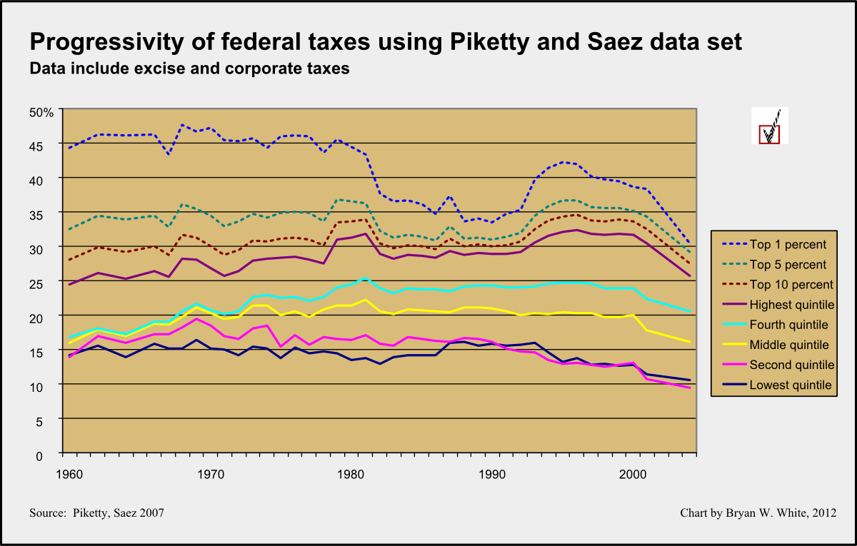
As discussed above, the graph shows two trends. The top three lines show the decrease in progressivity that Greenstone and Looney emphasize. At the same time, the five lines representing the five quintiles show increasing progressivity over the same period.
If we’re in search of a scandal, perhaps it’s the fact that the second quintile now pays a lower effective tax rate than the lowest income quintile, using the data from Piketty and Saez. That phenomenon failed to appear in the CBO numbers I used for the earlier chart.
Related Posts
 Slate helps spread PolitiFact’s false narrative
 PolitiFact stands pat with misleading Bush v. Gore narrative
- Review: ‘Bias in Fact Checking?: An Analysis of Partisan Trends Using PolitiFact Data’
- What is a “small error” at PolitiFact?
- ZFC on Medium (2016): ‘Fact Check This, Bill Adair’
 The secret slanders of the International Fact-Checking Network